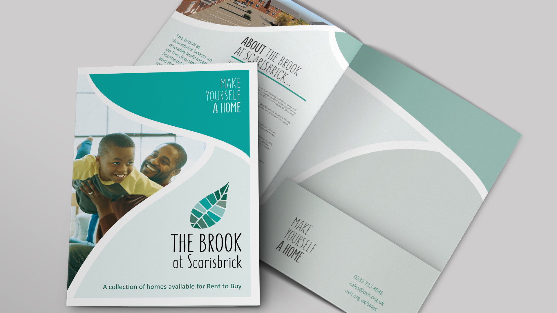
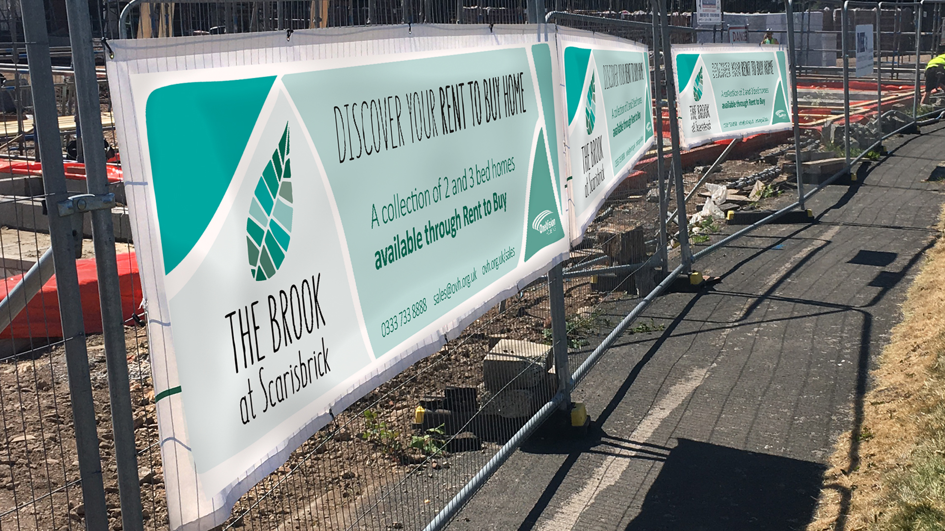
The Brook at Scarisbrick
Development brand for One Vision Housing
One Vision Housing requested a brand for a new development aimed at families, in a rural location, close to a brook.
The logo icon depicts a leaf to represent the rural location. The veins of the leaf illustrate the brook and streams that run through the area. This also looks like a birds-eye view of a site plan.
The style of the icon with its soft curves is run through the whole brand. A full suit of marketing materials were created for this scheme, including marketing packs, signage, banners and site plans.